Opting for evolution instead of revolution
17 June 2019
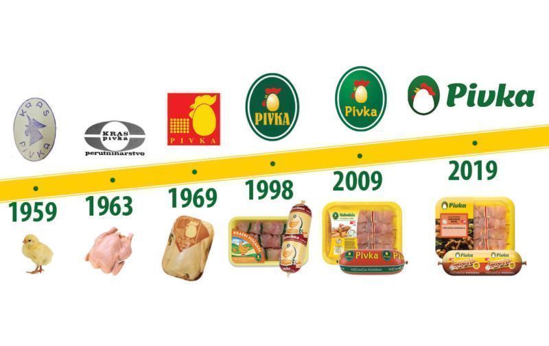
The Pivka brand got a new look as a part of anniversary celebrations. The logo and the image of the entire product portfolio have been redesigned. Yellow features prominently in the new design; yellow is said to provide simple recognition and better memorization. A key advantage of the new brand image of Pivka is that the brand name has been brought to the fore and photos on packaging have been updated to make the product even more visually appealing. The elements added to the products in photos were selected to enrich the photo without taking the focus off the main product. Damjan Oblak, head of sales at Pivka perutninarstvo, says that the redesign has been an evolutionary process making sure that the current customers can recognize their favorite products on the shelves quickly while endeavoring to attract new customers with a refreshed design. “The aim is to use the redesign to improve perceptions regarding our product quality assurance and have our excellence recognized by consumers,” he added.
REDESIGN TO CELEBRATE THE COMPANY’S SIXTIETH ANNIVERSARY
The Pivka brand was born with the establishment of Perutninski zavod Kras. Pivka perutninarstvo has had a clear vision since its inception in 1959. A while ago Slovenian consumers were surveyed about their perception of the company and the reply was that the company was seen as a traditional brand, available on many points of sale and offering good quality products of excellent taste that one would not mind recommending to one’s friends. They were least recognized by consumers under the rubric of youthfulness, contemporariness, and attractiveness of packaging, which is why they accepted a challenge upon their jubilee to face the issue and celebrate their sixtieth anniversary as a youthful and attractive enterprise. “The challenge demanded courage. Courage to decide to refresh and modernize the corporate image. We were aware that there is a lot of emotional attachment to graphic elements and that those were the stories and practices that have brought us to the point of having a brand recognized as good by various stakeholders. But one should take a step further to achieve new victories,« says Karmen Rodman, head of Strategic Marketing at Pivka perutninarstvo.
The aim was to graphically link products in a group while ensuring a contemporary look for the entire Pivka product range. The found solution also reflects the company’s values. The logo reflects pride and responsibility in the image of a chicken and goal orientation in the letters in italic spelling Pivka. “We have remained true to ourselves and have only made it clearer as to what we aim at day by day. We are still the ones you know so well although we have been rejuvenated in our mature age. Our brand has experience and tradition on its side and will now be even easier to find, more attractive and youthful at a store near you. We rejected revolution and opted instead for evolution, advancing on rock solid foundations of the past. The key part is to make changes as seamless as possible for our customers and to stand out from the competition, says Dr. Rodman.
A THEME IN YELLOW
Špela Žitko, Pivka brand manager, says that the theme of the graphic redesign is the color yellow, which had already been a sign of recognition of Pivka. “A recognizable yellow color was selected to indicate to our customers that while the image has changed the quality has remained the same. We keep in line with our tradition and can be trusted. Certain modernized elements and a refreshed logo make the Pivka brand more visible. The redesign sign on the left-hand side balances and revives the logo. Contemporary photos of ready meals featured on the packaging are aimed at instilling a desire for culinary delights in the consumer’s mind. The redesigned graphic image coupled with state-of-the-art technology also expands the opportunities to add new items to our product range.”
REDESIGN PROCESS IN COOPERATION WITH PRISTOP
The redesign process was initiated when we came together with the Pristop agency which develops brand and communication strategies, provides creative solutions and purchases advertising space. Katja Uljan Šinkec, head of Marketing at Pivka, says that the biggest attention was paid to the combination of tradition and a contemporary redesign of the packaging and the logo: “In my experience, it is something much harder to do than it would seem at first glance. The brand and the products are our “children” which each one of us views differently. Hence our views on how the “children” should be “raised” differ at times. However, our common goal is the satisfaction of customers and employees. Achieving an adequate level of satisfaction and examining all elements affecting it demand a lot of time and effort.”
The basis was customer surveys revealing that the “green egg” was well recognized whereas the brand name in the same oval was poorly visible. The redesigned logo preserved the essence of the color and the shape and highlighted the name better. The brand name is also the name of the location and it is therefore important that a graphic sign is added to the name communicating the company’s activity while at the same time being contemporary and stating the brand’s promises such as expertise and safety, which are very important in meat sales, noted Pivka staff.
A brand should be constantly developed and brought closer to customers and Pivka plans its development towards product range expansion catering to the needs of contemporary active consumers. There are no immediate plans for a graphic redesign but the company plans to develop practical packaging and expand product range as prompted by trends.
The article was originally published in June, 456th edition of Marketing Magazin.


